<p>Introduction</p>iOS 18 is the latest version of Apple’s mobile operating system, and with it comes a range of new features that make app development even more powerful and versatile. One such feature is the ability to customize app colors in iOS 18, allowing developers to create a truly unique and visually appealing user experience.
In this guide, we will explore everything you need to know about customizing app colors in iOS 18, including best practices, case studies, and expert opinions. We will also provide step-by-step instructions for implementing custom colors in your own apps, so that you can start reaping the benefits of this powerful feature right away.
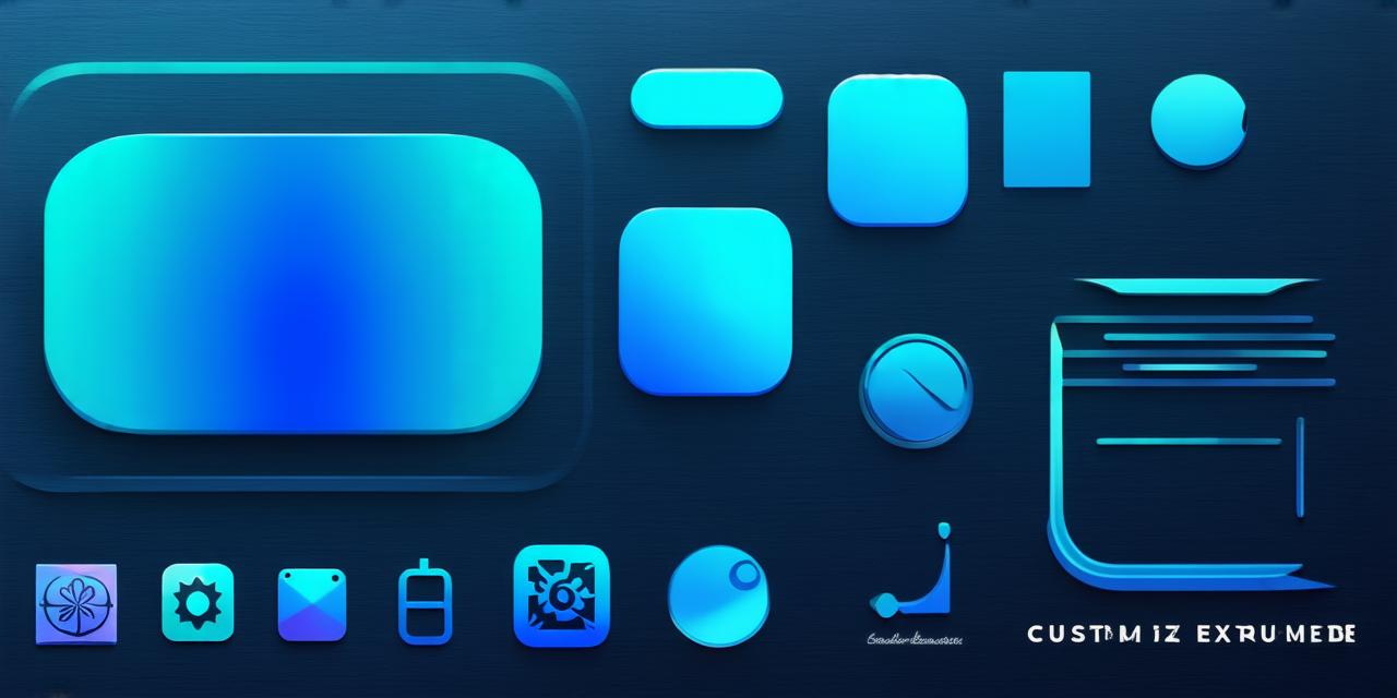
The Benefits of Customizing App Colors in iOS 18
Before we dive into the technical aspects of customizing app colors, let’s explore the many benefits that this feature offers to developers.
Improved User Experience
Customizing your app’s colors can significantly improve the user experience by making it stand out from other apps in the market. This not only makes your app more visually appealing but also helps users navigate through your app more easily.
For example, if you use contrasting colors for buttons and backgrounds, users will be able to quickly identify which elements are clickable and where they need to go next. In addition, using colors that match the overall theme of your app can create a cohesive and immersive experience for users.
Brand Consistency
By customizing your app’s colors, you can maintain brand consistency across all platforms and devices. This is especially important for businesses that have a strong brand identity and want to ensure that their customers receive the same level of experience regardless of where they interact with the brand.
For example, if your company has a specific color palette that you use consistently in all your marketing materials, you can apply the same colors to your app to create a cohesive brand image.
Increased Engagement
Customizing app colors can also increase engagement by making your app more visually interesting and appealing. By using bright, bold colors or unique color combinations, you can grab users’ attention and encourage them to interact with your app for longer periods of time.
Competitive Advantage
In a crowded market, having a well-designed app that stands out from the competition is essential for success. Customizing your app’s colors can give you a competitive advantage by making your app more visually appealing and memorable than other apps in the market.
Best Practices for Customizing App Colors in iOS 18
Now that we have covered the benefits of customizing app colors let’s take a look at some best practices to follow when implementing this feature in your own apps.
Know Your Audience
Before you start customizing your app’s colors, it is important to know your audience and what they prefer. Conducting user research can help you understand their preferences and design an app that resonates with them.
For example, if your target audience is primarily female users, using pastel colors or bright pink may be more appealing than dark, bold colors. On the other hand, if your target audience is male users, using darker, more muted colors may be more effective.
Use a Consistent Color Palette
Using a consistent color palette across your app is essential for creating a cohesive and visually appealing experience for users. This means using the same colors for buttons, backgrounds, text, and other elements throughout your app.
For example, if you use blue as your primary color, make sure to use it consistently in all buttons, backgrounds, and other elements that are important to the user experience.
Avoid Overusing Colors
While customizing app colors can be a powerful way to create a visually appealing experience for users, it is important to avoid overusing colors. Using too many colors can be overwhelming and distracting, making it difficult for users to focus on the content of your app.
For example, using three or four primary colors, with secondary and tertiary colors used sparingly, can create a balanced and visually appealing color palette that is easy on the eyes.

Use Color Psychology

Color psychology is the study of how colors affect human behavior and emotions. By understanding the psychological effects of different colors, you can use them to your advantage in app design.
For example, using red as a primary color can create a sense of urgency and encourage users to take immediate action, while blue can create a feeling of calm and trust, making it ideal for apps that deal with sensitive information such as banking or healthcare.
Case Studies: Successful Customization of App Colors in iOS 18
Let’s take a look at some real-life examples of successful customization of app colors in iOS 18 to see how this feature can be implemented effectively in different types of apps.
Instagram is one of the most popular social media apps in the world, with millions of users sharing photos and videos every day. The app’s iconic color scheme of white and pink has become synonymous with its brand, and it is a great example of how customizing app colors can create a strong visual identity.
The app uses white as its primary color for the background and most buttons, while pink is used sparingly throughout the app to draw attention to important elements such as profile pictures and notifications. The use of contrasting colors makes it easy for users to navigate through the app and find what they are looking for.
Uber
Uber is a popular ride-sharing app that has revolutionized the transportation industry. Its app’s iconic color scheme of black, white, and gray creates a sleek and modern look that is easy on the eyes.
The app uses